Measures of position, also known as position indices, or measures of central tendency, are values that summarize the position of a statistical distribution, providing a single figure that encapsulates the most important aspects of the data. In this brief discussion, we will explore some of the most common and practical indices, such as the various types of means, the median, quartiles, and percentiles.
- Measures of Central Tendency
- Arithmetic Mean
- The Mean of Grouped Data
- The Weighted Mean
- The Geometric Mean
- The Harmonic Mean
- The Trimmed Mean
- The Median
- The Mode
- Relationship Between Mean, Median, and Mode
- Quartiles, Deciles, and Percentiles
- An Overview: The Very Useful 5 Numbers
- Let’s Help Ourselves with a Clever Graph: The Boxplot
Measures of Central Tendency
A mean is a measure of the central tendency of a set of values.
Arithmetic Mean
The arithmetic mean, as we all learned in school, is the sum of the values in a data set divided by the number of values.
In statistics, a parameter of a population is represented by a Greek letter, while a descriptive measure of a sample is denoted with a Roman letter.
Note: For this discussion, we will consistently refer to population parameters.
Here is the formula to calculate the population mean:
\( \mu = \frac {\Sigma X}{N} \\ \\ \)In R, the function is mean(). A simple example:
variable = c(-3,1,2,4,5,2,8);
mean(variable);

[1] 2.714286
The Mean of Grouped Data
Let’s imagine we have n data points grouped into k classes. We’ll call xc the central value of each class and fi the observed frequency of each class.
The formula to calculate the mean in this case is:
\( \bar x = \frac{\sum^{k}_{i=1} x_c f_i}{N} \ \ \)Let’s look at an example:
| Class | xc | fi | xc * fi |
| 4<x≤8 | 6 | 5 | 30 |
| 8<x≤12 | 10 | 11 | 110 |
| 12<x≤20 | 16 | 14 | 224 |
| 20<x≤28 | 24 | 7 | 168 |
| Total | 37 | 532 |
Let’s use the formula and calculate the mean:
\( \bar x = \frac{(65) + (1011) + (1614) + (247)}{37} \ \ = \frac{532}{37} = 14.38 \)The Weighted Mean
The weighted mean, or weighted average, is an arithmetic mean where each value is weighted according to its importance within the group.
Each value in the group (X) is multiplied by the appropriate weight factor \( \omega \) and the various products are summed and divided by the sum of the weights:
Let’s look at an example. Imagine a sporting discipline where the jury’s score for each exercise is “weighted” with a certain difficulty coefficient. We would have these scores for the various exercises:
| Jury Score | Coefficient |
| 9.3 | 4 |
| 9.8 | 2.8 |
| 8.8 | 3.3 |
Let’s multiply each score by its respective coefficient:
(9.3 * 4) + (9.8 * 2.8) + (8.8 * 3.3) = 93.68
The sum of the coefficients (i.e., the “weights”) is:
4 + 2.8 + 3.3 = 10.1
And calculate the weighted mean:
93.68 / 10.1 = 9.275
The Geometric Mean
Given a set of positive numbers x1,x2,…,xn the geometric mean is the nth root of the product of the n numbers. In formula:\( \ \newcommand{\vc}[3]{\overset{#2}{\underset{#3}{#1}}} Geometric \ Mean = \sqrt[n]{\vc{\Pi}{n}{i=i} \ x_{i}} \)
N.B. The capital Greek letter pi is the symbol for product. The formula therefore equals this:
\( \\ Geometric \ Mean = \sqrt[n]{x_{1} x_{1} … x_{n}} \\ \\ \)R doesn’t have a built-in function for calculating the geometric mean, but calculating this measure of position is very simple. Let’s look at an example:
data = c(2,9,12) # My values
n = length(data) # the number of values

# prod calculates the product of vector elements
# Calculate the geometric mean
prod(data)^(1/n)
The Harmonic Mean
The harmonic mean of a dataset x1, x2, …, xn is the reciprocal of the arithmetic mean of the reciprocals of the data. In formula:
\( Harmonic \ mean = \frac{1}{\frac{1}{n} \vc{\Sigma}{n}{i=i} \frac{1}{x_{i}}} \\ \\ \)Similarly, for the harmonic mean, there is no specific built-in function available. However, since the harmonic mean is the reciprocal of the mean of the reciprocals of the data, the calculation is straightforward:
1/mean(1/data)
Using the very simple example mentioned above:
data = c(2,9,12) # My values
n = length(data) # The number of values

# Calculate the harmonic mean
1/mean(1/data)
The Trimmed Mean
A trimmed mean (e.g., at 5%) is an arithmetic mean of all ordered values after excluding the lowest 5% and the highest 5% from the dataset. In the example chosen, this mean is obtained by calculating the arithmetic mean of the central 90% of the population in the sorted series of observations.
In R, the trimmed mean can be calculated by specifying the trim=proportionToExclude option in the mean() function, where proportionToExclude is the proportion (between 0 and 1) of the smallest and largest values to exclude before calculating the arithmetic mean.
A simple R example to clarify:
variable = c(-3,1,2,4,5,2,5,0.8,2.4,6,8);
mean(variable, trim=0.05);  ### 5% trimmed mean

[1] 3.018182
The Median
The median of a group of elements is the value of the central element when all the elements in the group are arranged in ascending or descending order of value.
In practice, the median of a dataset is the value that divides the series into two equal parts: as many values above the median as below it.
To find the median, the rule known as even-odd rule is used:
In practice, the formula for finding the median can be summarized as follows:
The median can be calculated in R using the median() function:
var = c(0,1,2,3,6,7,11,14);
median(var);

[1] 4.5
The Median of Grouped Data
For grouped data, you must:
1. Determine which class contains the median value
and then
2. Use interpolation to determine the position of the median within that class.
The class that contains the median is the first class whose cumulative frequency equals or exceeds half the total number of observations. Once this class is identified, the specific value of the median is determined using the formula:
where:
CI = lower boundary of the class containing the median
N = total number of observations in the frequency distribution
fcp = cumulative frequency of the class preceding the one containing the median
fc = number of observations in the class containing the median
i = width of the class interval
As always, an example illustrates how the operational reality is simpler than it first appears. Let’s consider a distribution divided into frequency classes. In our example, we are dealing with height classes:
| Height (cm) | Frequencies | Cumulative Frequencies |
| 150 – 160 | 4 | 4 |
| 160 – 170 | 8 | 12 |
| 170 – 180 | 10 | 22 |
| 180 – 190 | 8 | 30 |
| 190 – 200 | 4 | 34 |
The class containing the median is the first class whose cumulative frequency equals or exceeds half the total number of observations, which, as seen in the table, is 34/2 = 17.
The median class, containing the value 17, is therefore the 170–180 class.
We can then easily extract all the values to insert into our interpolation formula:
CI = lower boundary of the class containing the median = 170
N = total number of observations in the frequency distribution = 34
fcp = cumulative frequency of the class preceding the one containing the median = 12
fc = number of observations in the class containing the median = 10
i = width of the class interval = (180 – 170) = 10
therefore
\( Med = 170 + (\frac{(34/2) – 12}{10}) * 10 = 175 cm \)The median value of the median class (170–180 cm) is 175 cm.
For this reason, for example, in the case of a skewed distribution, the median is a more reliable indicator than the mean, which will always be “pulled” toward the tail of the distribution. In a skewed distribution, the median will always fall between the mean and the mode.
The Mode
The mode of a dataset is the value that appears most frequently.
For example, consider the frequency of scores in a test:
| score | frequency |
| 5 | 5 |
| 6 << this is the mode | 11 |
| 7 | 8 |
| 8 | 7 |
| 9 | 3 |
A distribution like this is called unimodal.
In the case of a small dataset where no measured value repeats, there is no mode.
When two non-adjacent values both have the same maximum frequency, the distribution is said to be bimodal.
Distributions with several modes are called multimodal.
In R, we can find the mode very easily using the which.max() instruction:
var = c(3,6,7,7,9,11,12,12,12,14,15,16,17,22,29,31);
frequency=tabulate(var);
which.max(frequency);

[1] 12
Mode of Grouped Data
For grouped data in a frequency distribution with equal class intervals, first identify the class containing the mode by finding the class with the highest number of observations. Then use the formula:
\( Mode = C_{I} + (\frac{d_{1}}{d_{1}+d_{2}})i \)where:
CI = lower boundary of the class containing the mode
d1 = difference between the frequency of the modal class and the frequency of the previous class
d2 = difference between the frequency of the modal class and the frequency of the next class
i = class interval width
Relationship Between Mean, Median, and Mode
In the case of grouped data represented by a frequency curve, the difference between the values of the mean, median, and mode reveals the shape of the curve in terms of symmetry.
For a symmetric unimodal distribution, the mean, median, and mode coincide, meaning they have the same value.
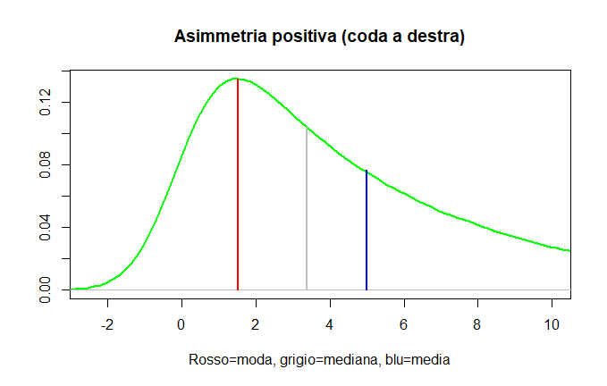
In the case of a positively skewed distribution, the mean is the largest value, and the median is larger than the mode.
Thus:
Positive skewness = tail on the right = Mean > Median > Mode

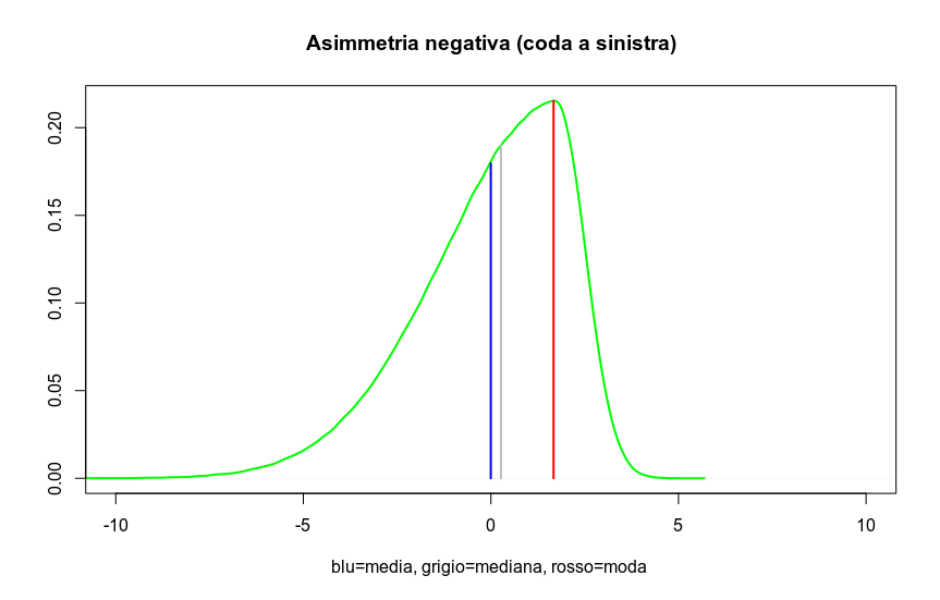
In the case of negative skewness, the mean has the smallest value, and the median is smaller than the mode.
Thus, in summary:
Negative skewness = tail on the left = Mean < Median < Mode

A well-known measure of skewness, which uses the observed difference between the mean and the median of a group of values, is Pearson’s skewness index, which we will explore in more detail when introducing the concept of variability measures, as it includes the standard deviation in the denominator. For now, we can anticipate it as:
\( Skewness = \frac{3(\mu – Med)}{\sigma} \)Quartiles, Deciles, and Percentiles
Quartiles, deciles, and percentiles are similar to the median as they divide a distribution of measurements according to the proportion of observed frequencies.
While the median divides the distribution into two halves, quartiles divide it into four quarters; deciles into ten tenths; percentiles into 100 hundredths. For ungrouped data, the formula for the median is modified depending on the desired fraction:
\( Q_{1} \ (first\ quartile) = X_{(\frac{n}{4} + \frac{1}{2})} \\ D_{3} \ (third\ decile) = X_{(\frac{3n}{10} + \frac{1}{2})} \\ P_{60} \ (sixtieth\ percentile) = X_{(\frac{60n}{100} + \frac{1}{2})} \\ \)In R, they can be calculated as follows:
var = c(3,6,7,7,9,11,12,12,14,15,16,17,22,29,31);
quantile(var, probs=c(0.25,0.50,0.75)); ### quartiles

 25%  50%  75%
 8.0 12.0 16.5

quantile(var, probs=c(1:9)/10); ### deciles

 10%  20%  30%  40%  50%  60%  70%  80%  90%
 6.4  7.0  9.4 11.6 12.0 14.4 15.8 18.0 26.2
Quartiles, Deciles, and Percentiles for Grouped Data
In this case, you must first determine the class containing the point corresponding to the desired fraction, referencing cumulative frequencies, and then interpolate. For example:
\( Q_{1} \ (first\ quartile) = C_{1} + (\frac{\frac{n}{4} – fc_{p}}{f_{c}})i \\ D_{2} \ (second\ decile) = C_{1} + (\frac{\frac{3n}{10} – fc_{p}}{f_{c}})i \\ P_{60} \ (sixtieth\ percentile) = C_{1} + (\frac{\frac{60n}{100} – fc_{p}}{f_{c}})i \\ \)An Overview: The Very Useful 5 Numbers
There is a summary description of data that allows us to immediately visualize key measures:
- The minimum value of our data
- The value of the first quartile
- The median
- The value of the third quartile
- The maximum value
The 5 numbers are often an excellent starting point for analyzing the characteristics of a distribution. In R, we have a specific command called (appropriately) fivenum():
var = c(3,6,7,7,9,11,12,12,14,15,16,17,22,29,31);
fivenum(var);

[1]  3.0  8.0 12.0 16.5 31.0
Let’s Help Ourselves with a Clever Graph: The Boxplot
The boxplot (or box diagram) is a type of graph invented by the great John Tukey to provide a clear overview of a dataset at a glance.
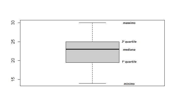
The boxplot can be oriented horizontally or vertically and appears as a rectangle divided into two parts, with two lines extending from it. The rectangle (the “box”) is bounded by the first and third quartiles and is divided internally by the median. The “whiskers” represent the minimum and maximum values.
Note: The presence of “whiskers” is the reason this diagram is often called a box-and-whisker plot or box-and-whisker diagram.
This way, the four equally populated intervals defined by the quartiles are graphically represented.
Using a simple data distribution, here is how to call the boxplot function in R:
dati <- c(24,17,21,23,15,30,24,21,24,19,25,28,22,20,14,19,26,29,23,25,24,18,27,21);
boxplot(dati,ylab="",col=gray(0.8));
Adding some labels here and there for better clarity, the result is this:

An extremely effective "snapshot" of the observed value distribution.
