In previous posts, we have examined concepts such as the mean and standard deviation, which are capable of describing a single variable. These statistics are of great importance; however, in daily practice, it is often necessary to investigate the relationships between two or more variables. This is where new key concepts emerge: correlation and regression analysis.
Correlation and regression analysis are tools widely used during the analysis of our datasets.
They involve estimating the relationship between a dependent variable and one or more independent variables.
Simple Linear Regression
We can consider regression as a method suitable for finding a mathematical relationship that expresses a link between a variable y (the dependent variable or response variable) and a variable x (the independent variable or predictor variable).
The first useful step to qualitatively investigate the possible dependence between two variables x and y is always to draw a graph, called a scatter diagram (scatterplot).
We place the data relating to one of the two variables on the abscissa, the data relating to the other variable on the ordinate, and we represent the individual observations with points. Remember that scatter plots compare two variables.
If there is a simple relationship between the two variables, the diagram should show it!
Let’s use some example values and let R draw our scatter diagram.
I put some imaginary data in a CSV file relating to a hypothetical correlation between the ambient temperature recorded in my city and the sales of ice cream. I name the file gelati.csv and save it as plain text in any folder on my filesystem (in my example in tmp/gelati.csv). The file will have this content:
temperatura,gelati
25,58
30,70
29,61
26,53
25,48
28,66
24,47
22,47
20,40
18,29
22,33
Now I open R Studio and load my dataset:
gelati <- read.csv("/tmp/gelati.csv")
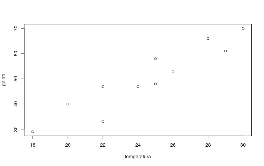
Then I plot the scatterplot to see if the figure is compatible with a linear regression hypothesis:
plot(gelati)

The diagram shows an evident linear correlation, with an upward trend.
Pearson’s Correlation Coefficient r
There are various types of correlation coefficients in statistics. If the relationship to be investigated is between two variables of interval or ratio type (i.e., quantitative, numerical variables), the best known and most used is certainly Pearson’s correlation coefficient, generally indicated with the letter r.
I use the R language (not to be confused with the coefficient r) for a practical example with Pearson’s correlation coefficient.
The function to use is cor():
cor(gelati$temperatura,gelati$gelati)

[1] 0.9320279
As you can see, the correlation in this example is very strong.
r is a standardized value ranging from +1 to -1. The further it is from zero and closer to 1 (or -1 in the case of negative correlation), the stronger the correlation.
If r is positive, the correlation is positive, meaning y increases as x increases.
If r is negative, y decreases as x increases.
But when can I say that a correlation is strong or very strong, and when is it moderate or even null? The answer is… it depends 🙂
There is no standard answer. Very arbitrarily, we can say that generally a correlation below 0.20 (or better, between -0.2 and +0.2) is considered very weak, between 0.2 and 0.5 (or between -0.2 and -0.5) moderate, between 0.5 and 0.8 (or between -0.5 and -0.8) quite strong. Correlations higher than 0.8 or lower than -0.8, very strong, are actually quite rare.
CAUTION 1: The most important thing is that the evidence of a relationship between two variables does not necessarily imply the presence of a cause-effect relationship between the two variables. This is a point of utmost importance, which must always be kept in mind. Both variables that in my study show a very strong correlation may actually depend on a third variable, or many other variables, which constitute the real cause. Finding and calculating the correlation between two variables is relatively simple; finding and especially proving a cause-and-effect relationship is extremely complex!
CAUTION 2: Another point I would like to emphasize is that Pearson’s correlation coefficient r measures the linear correlation between two variables. This means that two variables can show an apparent null correlation (r around 0) and yet be correlated, for example showing a curvilinear correlation. A classic textbook example concerns the correlation between stress level and performance in an exam. In fact, a slight stress contributes to improving performance, but beyond a certain threshold it is completely harmful, leading to a decline in the result. In this case, the analysis in terms of r and linear correlation would lead to discarding an existing correlation.
And now some math (but just a little)
Pearson’s correlation coefficient for a population, given two variables X and Y, is indicated by the Greek letter rho and is given by:
where:
- COV indicates the covariance
- σX is the standard deviation of X
- σY is the standard deviation of Y
- μx is the population mean for x
- μy is the population mean for y
- n is the number of elements in both variables
- i is the index ranging from 1 to n
- Xi is a single element of population x
- Yi is a single element of population y
To calculate the population covariance (which, we recall, is a non-standardized measure of the direction and strength of the relationship between the elements of two populations):
\( \sigma_{XY}=\frac{\sum\limits_{i=1}^n (X_i-\mu_x)(Y_i-\mu_y)}{n} \ \)where:
Note: to calculate the values for an estimated population, just use n-1 in the denominator. By default, R always uses the sample standard deviation, so the calculated value of Pearson’s r will always be calculated with n-1 in the denominator.
I take out the calculator – or paper and pen – and do some calculations…
This is my table, which I completed by computing the various values:
| temperatura | gelati | xi-X | yi-Y | (xi-X)-(yi-Y) | |
|---|---|---|---|---|---|
| 1 | 25 | 58 | 0.55 | 7.82 | 4.26 |
| 2 | 30 | 70 | 5.55 | 19.82 | 109.90 |
| 3 | 29 | 61 | 4.55 | 10.82 | 49.17 |
| 4 | 26 | 53 | 1.55 | 2.82 | 4.36 |
| 5 | 25 | 48 | 0.55 | -2.18 | -1.19 |
| 6 | 28 | 66 | 3.55 | 15.82 | 56.08 |
| 7 | 24 | 47 | -0.45 | -3.18 | 1.45 |
| 8 | 22 | 47 | -2.45 | -3.18 | 7.81 |
| 9 | 20 | 40 | -4.45 | -10.18 | 45.36 |
| 10 | 18 | 29 | -6.45 | -21.18 | 136.72 |
| 11 | 22 | 33 | -2.45 | -17.18 | 42.17 |
The sum of the values in the last column is 456.0909.
So I can calculate the covariance by dividing by n-1 = 10, therefore:
456.0909/10 = 45.60909
Calculating the sample standard deviations for X and Y, I find the values:
Sx = 3.751363
Sy = 13.04468
So Sx * Sy = 48.9353299
Last step. I can calculate r:
45.60909 / 48.9353299 = 0.9320278435
which, as you can see, perfectly coincides with the value provided by R’s cor() function.
The Coefficient of Determination r2
By squaring r, we obtain the coefficient of determination.
In our case, the coefficient of determination r2 will be:
R-squared = 0.86868
But what does this number mean?
r2 tells us to what extent our regression equation reproduces the variance of the data.
In other words, how much of the variation in the response variable is explained by the predictor variable. The more accurate the regression equation, the more the value of r2 tends to 1.
The cor() function in R allows you to easily obtain the correlation values calculated through all these methods, as you can easily see from the function’s syntax:
cor(x, y = NULL, use = "everything", method = c("pearson", "kendall", "spearman"))
Finding the Regression Equation
Our goal is to obtain the regression equation, and since it is a linear regression, the typical form will be:
y = mx + b
m indicates the slope of the line in the graph, and is called the regression coefficient.
b is the point where the line intersects the y-axis, and is called the intercept.
Always remember that the linear regression line is the line that best fits the data provided. Ideally, we would like to minimize the distances of all data points from the regression line. These distances are called errors and are also known as residuals. A good line will have small residuals.
We fit the regression line to the data points in a scatter plot using the least squares method.
The calculations are not difficult (I will not report the procedure here), but the procedure can be tedious. For this reason, all advanced scientific calculators and many spreadsheets and programs provide procedures that simplify our lives.
Using R, the process is even easier.
I proceed by calculating the parameters of the regression line:
# calculate the parameters of the regression line
lm(gelati$gelati ~ gelati$temperatura)

Call: lm(formula = gelati$gelati ~ gelati$temperatura)
Coefficients:
(Intercept) gelati$temperatura
-29.074 3.241
So my line will have the equation:
y = 3.241x - 29.074
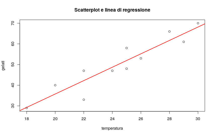
It’s time to plot the scatter diagram again, overlapping the regression line I just found:
# draw the scatterplot
plot(gelati$temperatura,gelati$gelati, main="Scatterplot and Regression Line",xlab="temperature", ylab="gelati")

# and draw the regression line in red
abline(lm(gelati$gelati ~ gelati$temperatura),col="red",lwd=2)

Outliers and Influential Points
An outlier is an extreme observation that does not fit the general correlation or regression pattern. In practice, in our graph we will see that such outliers, if any, will be very far from the regression line in the y direction.
The inclusion of an outlier can affect the slope and y-intercept of the regression line.
When examining a scatter plot and calculating the regression equation, it is worth considering whether or not anomalous observations should be included. They could in fact be errors in the data – and then they should be excluded – but also “real” values, and in this case they are information of the utmost importance for the analyst.
But when can we speak of outliers? There is no fixed rule when trying to decide whether or not to include an outlier in the regression analysis. This decision depends on the sample size, how extreme the outlier is, and the normality of the distribution.
For univariate data, an empirical rule based on the interquartile range IQR can be used to determine whether or not a point is an outlier.
We proceed in this way:
- Calculate the interquartile range for our data.
- Multiply the interquartile range (IQR) by 1.5.
- Add 1.5 x (IQR) to the third quartile.
Any number greater than the value found is a suspected extreme datum. - Subtract 1.5 x (IQR) from the first quartile. Any number lower is a suspected extreme datum.
An influential point is a point that, if removed, produces a significant change in the model estimate. An influential point may or may not be an outlier.
The influence.measures() command provides a whole series of useful influence measures: dfbeta, dffit, covratio, Cook’s distance and leverage points of all observations:
# measure influential points
influence.measures(lm(gelati$gelati ~ gelati$temperatura))
Model Assumptions
For the linear regression model to be effectively usable, some assumptions must be met:
- Normal distribution of errors: the errors must have, for each value of X, a normal distribution.
- Homoscedasticity: the variability of the errors is constant for each value of X.
- Independence of errors: the errors must be independent for each value of X (it is especially important for observations over time, in which it must be verified that there is no autocorrelation).
Therefore, specific tests of the model must be carried out, and all must give a positive result for the estimation model to be considered correct.
If even one of the tests gives a negative result (non-normality of the residuals, heteroscedasticity, serial correlation) the estimation method through least squares is not good.
Residual Analysis
The residual is equal to the difference between the observed value and the predicted value of Y.
- To estimate the goodness of fit of the regression line to the data, a graphical analysis is appropriate using a scatter plot of the residuals (on the ordinate) and the values of X (on the abscissa).
- To verify the assumptions, I can evaluate the graph of the residuals with respect to X: this allows us to establish whether the variability of the errors varies according to the values of X, confirming or not the assumption of homoscedasticity.
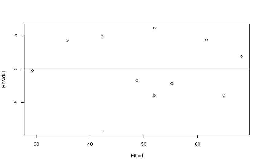
- To verify linearity, plot the residuals, on the ordinate, with respect to the predicted values, on the abscissa. The points should be distributed symmetrically around a horizontal line with an intercept equal to zero. Different trends indicate the presence of non-linearity.
# look at the distribution of residuals.
# must be balanced above and below the zero line.
lmgelati <- lm(gelati$gelati ~ gelati$temperatura)
plot (lmgelati$residual ~ lmgelati$fitted, ylab="Residuals",
xlab="Fitted")
abline(h=0)

R’s lmtest package provides us with the Breusch-Pagan test to verify the homoscedasticity of the residuals:
# check homoscedasticity of residuals
# using the Breusch-Pagan test
library(lmtest)
testbp <- bptest(gelati ~ temperatura, data=gelati)
testbp
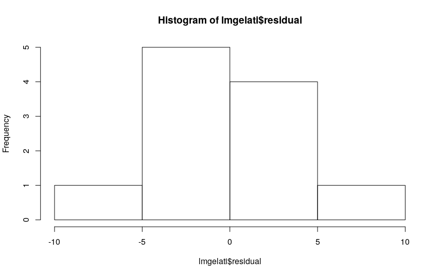
As for the normality of the residuals, the frequency histogram allows us to verify or not the condition.

We can also verify the normality of the residuals numerically, using a Shapiro-Wilk test:
# check the normality of the distribution of errors
# with a Shapiro-Wilcox test
residui <- residuals(lm(gelati$gelati ~ gelati$temperatura))
shapiro <- shapiro.test(residui)
shapiro
Let’s verify that the mean of the errors is not significantly different from zero. To do this we can use a Student’s t-test:
residui <- residuals(lm(gelati$gelati ~ gelati$temperatura))
t.test(residui)
The graph of the residuals with respect to time (and the use of the Durbin-Watson statistic) allows us to highlight the existence or not of autocorrelation.
# Durbin Watson test for autocorrelation
dwtest(gelati$temperatura~gelati$gelati)
Regression Analysis: Practical Difficulties
Simple regression analysis is a widely used model, but very, very insidious. The generalized tendency, in fact, is to use this type of analysis in a not very conscious and rigorous way – as for example in the simplified example I proposed 🙂
The assumptions underlying the model are rather stringent, and very often ignored…
Frequently, the analysis is carried out without taking into account the way in which these assumptions must be evaluated or the simple linear regression model is chosen instead of more appropriate alternative models.
Another very common error is given by extrapolation: that is, an estimation of values external to the range of observed values is made. This is a big no-no.
The advice is always to start the analysis by looking very carefully at the scatter diagram and to carefully verify the hypotheses underlying the regression model before using the results.
Other Types of Correlation Coefficients
Pearson’s correlation coefficient is certainly the best known, studied and used, but as we have seen it applies in cases where both variables are of quantitative type, measured through an interval or ratio scale. There are other methods that allow us to obtain the measure of correlation between variables of different types. All share the characteristic of being conceptually very similar to Pearson’s r coefficient.
The Point-Biserial Correlation Coefficient
Let’s take the case of an analysis in which one of the variables is of quantitative type (measured on an interval or ratio scale) and the second is a categorical variable with two levels (or dichotomous variable). In this case, the point-biserial correlation coefficient comes to our aid. I will not delve into the concept here, as it is in fact a “special” version of Pearson’s coefficient, leaving the reader to deepen when required by the analysis.
The Phi Coefficient
If we need to know if two dichotomous variables are correlated, we could then resort to the phi coefficient, another “special” case of Pearson’s r coefficient. Many readers will certainly know that two dichotomous variables can also be analyzed using a chi-squared test.
Spearman’s Rank Correlation Coefficient Rho (and a Note on Kendall’s Tau)
Sometimes the data are reported in terms of ranks. Ranks are a form of ordinal data, and since the other types of correlation coefficients do not treat this type of data, here is the need to introduce the use of Spearman’s rho coefficient. Spearman’s correlation follows a simple and ingenious approach: it converts each data set into ranks and then calculates the correlation. It is a non-parametric statistical measure of correlation: the only assumption required is that the variables are sortable, and possibly continuous.Here is the formula for Spearman’s coefficient:
\( \\ r_s=\frac{6\sum{d}_i^2}{N(N^2-1)} \\ \\ \)rs can also assume values between –1.00 and +1.00, with the same meanings seen for r.
The coefficient rs has a serious defect: it can give an overestimate of the correlation between X and Y if, for at least one of the two variables, there are many equal ranks. For this reason, to measure the correlation between two ordinal variables, another statistic is often used: Kendall’s tau coefficient.
